(Note: Part 1 of this series is here, part 2 is here, part 3 is here, part 4 is here, part 5 is here, part 6 is here, part 7 is here, and part 8 is here. 2011 addendums: a post that can be considered part 9 is here, part 10 is here.)
This post is part 8 of a series on the stunningly poor human engineering of production healthcare IT from major vendors, in use today at major medical centers. These devices provide a decidedly mission hostile user experience, yet with an almost religious fervor are being touted as cybernetic miracles to cure healthcare's ills.
April 2011 addendum: see what might be considered part 9 at this link.
My college is a member of the iSchool consortium, consisting of schools of information science and technology (notably, not "information technology and science").
The iSchools are interested in the relationship between information, people and technology. This is characterized by a commitment to learning and understanding the role of information in human endeavors. The iSchools take it as given that expertise in all forms of information is required for progress in science, business, education, and culture. This expertise must include understanding of the uses and users of information, as well as information technologies and their applications.
Note the "as well as." Note the primary focus, and that which is secondary. This philosophy parallels that of Medical Informatics well.
This probably sounds like Martian to many in the healthcare and perhaps the broader business IT sector.
One of my colleagues on reviewing this HIT series had this to say:
It's really nice to hear that for once IT professionals have been able to successfully repeat the development lifecycle for healthcare information systems:
- Fail to understand the problem ->
- create a fragmentary and inaccurate requirements definition ->
- design an ambiguous, ignorant and risk-laden user interface ->
- pull all the misguided notions together with baling wire and call it a design->
- translate the "design" into an executable form, adding and subtracting design elements at random ->
- observe the first output from the system and declare it ready for the healthcare professionals. fini
Did I miss anything?
I believe he captured the essense of today's HIT vendor market well.
Here are examples of screen displays of vital patient information, displays that force clinicians to go on wild goose chases and seem designed by true neophytes to the field of information presentation and user interaction design. This is not to single out any one vendor. Many vendor products have deficiencies.
See this display of something as simple (one would think) as blood pressures:
 (click to enlarge)
Note the following:
- Diastolic blood pressures in the left column;
- Systolic blood pressures in the roight column;
- An adventure to match them by date;
- No column headers at top.
Which value goes with which? How much energy does it use up to scroll around and connect the two?
This display is so poorly conceived, one wonders why it was included at all in a production system.
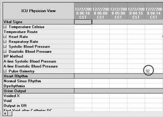
There's more. Let's troll for data, shall we?
See the blood oxygen saturation level, circled?
What percentage oxygen was this patient receiving?
It's not there! Where is it?
Scroll down ...
... and down ...
 (click to enlarge)
Our answer, at last! Circled. Of course, the corresponding pulse oximetry is now off the screen.
How much attention would it have taken to present the two together?
How much coding would it have taken with today's computers, that execute billions of instructions per second, to dynamically condense the presentation of information, eliminating the absolutely empty cells between the two values?
Similar isses are noted for other biomedically coupled values, such as coumadin dose and blood thinning value (INR).
Screw matching those up, and as my mentor Victor P. Satinsky, MD might have said, your patient's dead.
Speaking about information sparsity, how's this display?
 (click to enlarge)
There's one value in the entire screen. What a waste. How much difficulty would it have been to simply present the one row, automatically?
The EHR disperses and fragments vital patient information. How, exactly, is this is supposed to make clinicians more efficient and less error prone?
I am only presenting the easiest to present problems, easiest that is in a static medium such as a blog.
If presented dynamically, we find with some EHR's, for example, that it takes 50 or so mouse clicks across various screens and drop down lists and drop boxes to enter 5 common diagnoses.
It takes selecting from multiple hierarchical lists and buttons across four different screens, multiple times repetitively, to find out how well a patient is eating.
Here is simple advice from J Gen Intern Med 2009; 24(1):21-26.
Do the HIT vendors actually read such advice?
I wonder.
Medical Informatics reminds me of dentistry in its early days. B.T. Longbothom, author of the second dentistry book published in the U.S. ("A Treatise on Dentistry", 1802), gave an excellent description in his preface of problems at the time. His observations apply to Medical Informatics in our present age:
Hardly anyone spoke out.
More than thirty years later, untrained practitioners were as prevalent as ever. One of the leading dentists of the time, Shearjashub Spooner, in his "Guide to Sound Teeth, or, A Popular Treatise on the Teeth" (1836) warned the public of a phenomenon I believe now applies to Medical Informatics and healthcare IT:
I understand that point of view.
And with that, I end this series.
-- SS
The EHR disperses and fragments vital patient information. How, exactly, is this is supposed to make clinicians more efficient and less error prone?
I am only presenting the easiest to present problems, easiest that is in a static medium such as a blog.
If presented dynamically, we find with some EHR's, for example, that it takes 50 or so mouse clicks across various screens and drop down lists and drop boxes to enter 5 common diagnoses.
It takes selecting from multiple hierarchical lists and buttons across four different screens, multiple times repetitively, to find out how well a patient is eating.
Here is simple advice from J Gen Intern Med 2009; 24(1):21-26.
It is imperative that usability principles are embedded in CPOE design to avoid
• overly complex screens
• poor grouping of like terms
• an inflexible human-computer interface
• mis-use of clinician time
Do the HIT vendors actually read such advice?
I wonder.
Medical Informatics reminds me of dentistry in its early days. B.T. Longbothom, author of the second dentistry book published in the U.S. ("A Treatise on Dentistry", 1802), gave an excellent description in his preface of problems at the time. His observations apply to Medical Informatics in our present age:
The word "dentist" has been so infamously abused by ignorant pretenders, and is in general so indifferently understood, that I cannot forbear giving what I conceive to be its original meaning: viz, the profession of one who undertakes and is capable not only of cleaning, extracting, replacing by transplantation and making artificial teeth, but can also from his knowledge of dentistry, preserve those that remain in good condition, prevent in a very great degree, those that are loose, or those that are in a decayed state, from being further injured, and can guard against the several diseases, to which the teeth, gums and mouth are liable, a knowledge none but those regularly instructed, and who have had a long, and extensive practice, can possibly attain, but which is absolutely necessary, to complete the character of a Surgeon Dentist.
Hardly anyone spoke out.
More than thirty years later, untrained practitioners were as prevalent as ever. One of the leading dentists of the time, Shearjashub Spooner, in his "Guide to Sound Teeth, or, A Popular Treatise on the Teeth" (1836) warned the public of a phenomenon I believe now applies to Medical Informatics and healthcare IT:
One thing is certain, this profession must either rise or sink. If means are not taken to suppress and discountenance the malpractices of the multitude of incompetent persons, who are pressing into it, merely for the sake of its emoluments, it must sink, - for the few competent and well educated men, who are now upholding it, will abandon a disreputable profession, in a country of enterprise like ours, and turn their attention to some other calling more congenial to the feelings of honorable and enlightened men.
I understand that point of view.
And with that, I end this series.
-- SS


5 comments:
thanks for sharing...
Scot, I've enjoyed the series and have recognized way too many of your mockups as our current EHR. But seriously, what's the solution?
Does it exist? Has it yet to be conceived and written? Is there something out there that works?! or are we just relegated to mediocrity?
But seriously, what's the solution? Does it exist? Has it yet to be conceived and written? Is there something out there that works?! or are we just relegated to mediocrity?
No, as other industries - aerospace, banking - have shown, we are not automatically relegated to mediocrity.
We are, however, relegated to HIT mediocrity is we as a profession allow leadership of HIT, and of medicine itself, to be mediocre.
The solution, as our new president says, is commitment and action.
-- SS
Your final comments actually illustrate the whole problem. Those who graduate in computer science have been trained to accept progressively higher levels of linear abstraction - this line of code, the next, the next to a goal. Medicine is training to to take increasing number of facts and relate them together then eventually to the patient - a concrete person.
The examples here given as bad all follow a linear progression - good programming - bad medicine. For an EMR the trick is to group concrete elements relationally in a linear progression that helps make an abstract conclusion - this is the crux of the problem - and Medscribbler's raison d'etre.
Sorry for all the Medscribbler referrances but I know of no others pursuing this as seriously as we are.
For an EMR the trick is to group concrete elements relationally in a linear progression
The issues here are not "programming", nor are there "tricks" in crafting effective IT.
The issues are of how virtual medical devices are conceived, built, refined, and managed through their lifecycle.
The way to make EMR's effective involves proper incorporation of domain expertise, proper leadership, and proper governance. When those are appropriate, results will follow.
-- SS
Post a Comment